Design process
How to present logo concepts before the design is final
A first review is not a reveal of finished artwork. It is a decision about which idea deserves development.
The short answer
Present each viable logo direction against the same brief and the same application tests. Explain what is decided, what is provisional and what you need the client to choose. End with one documented direction and specific next steps—not a vote for the prettiest mockup.
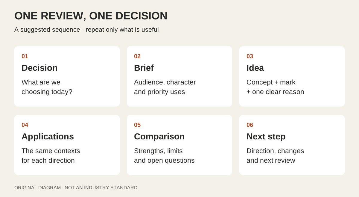
Start by naming the decision
A client sees three logos and asks whether the blue could be darker. You wanted to discuss the idea; they thought you were approving final artwork. Neither person is necessarily wrong. The presentation did not make the stage clear.
Open with a sentence such as: ‘Today we are choosing a direction for the identity. We will refine the selected mark, spacing and color after this review.’ If color is central to the concept, discuss it now—but distinguish the strategic choice from a final color specification.
For the examples below, imagine a fictional neighborhood workshop called North Room. It runs small evening classes for adults. The brief asks for a welcoming, practical identity that remains recognizable on a phone booking page and a simple door sign. These are invented teaching examples, not a client case or a tested brand.
| Question | Working answer |
|---|---|
| Who needs to recognize it? | Local adults choosing a first workshop |
| What must it communicate? | An approachable place to make things, without a children's-club tone |
| Where must it work first? | Booking page, timetable and door sign |
| What do we decide today? | Which concept to develop, and which concerns to test next |
Show directions you can defend—not a quota
The number of concepts follows the agreed scope and the genuinely different answers you have found. One developed recommendation can be appropriate; several distinct directions can be appropriate too. There is no universal number that makes a review professional.
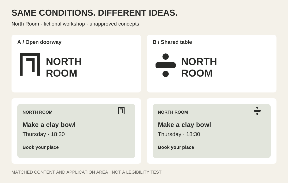
A rounded and a square version of the same symbol may be refinements within one idea, not two strategic concepts. Name the idea in plain language so the distinction is visible. For North Room, ‘Open doorway’ emphasizes invitation; ‘Shared table’ emphasizes making together. A client should be able to explain that difference without repeating your design vocabulary.
Do not add a knowingly weak option to make your favorite look stronger. It can be selected, and it makes the comparison less honest. If only one direction meets the brief, show why and identify what remains uncertain.
Give each concept the same short story
Use a repeatable sequence: the idea, a clean view of the mark, an explanation of one or two choices, then the applications that matter. Keep the explanation tied to the brief rather than inventing a meaning for every curve.
For ‘Open doorway,’ a useful rationale is: ‘The opening suggests an accessible place; the sturdy wordmark keeps it practical rather than delicate.’ That is a design intention, not evidence that every viewer will perceive it that way. An unexplained cultural association or a recognition concern is a reason to investigate, not a reason to talk louder.
The Futur's practitioner walkthrough also connects a logo presentation with prior discovery and relevant applications. Treat it as one practitioner's approach, not proof that a particular slide order or concept count guarantees approval.
Further reading: The Futur: presenting logo designs and identity projects
Compare the artwork under equal conditions
A glossy shopfront can make an ordinary mark feel established. A rough screenshot can make a promising one look unfinished. Before the atmospheric views, put the concepts on the same quiet background with comparable visual prominence. Use judgment rather than forcing every mark into the same bounding box: a wide wordmark and a compact symbol occupy space differently.
Then give each direction the same useful tests. North Room needs a booking-page header, a readable class timetable and a door sign—not a luxury perfume bottle. Keep the message, layout and background comparable so the differences you discuss belong mainly to the identity.
Show a plain one-color view when that is relevant to the intended uses. If an identity depends on color relationships, explain that dependency instead of pretending a recolor proves it works everywhere. A presentation illustration is not a production proof, and a tiny mockup does not establish real-world legibility.
Separate a promising idea from unfinished execution
A good concept can have awkward spacing. A beautifully drawn mark can answer the wrong brief. Keep those findings in different columns so a correctable detail does not silently become a rejection of the whole direction.
For North Room, a client might say the doorway looks welcoming but the name is hard to read on the timetable. Record both: preserve the invitation idea; investigate lettering and placement. If the concept instead looks like a property company, that may be a more fundamental fit problem. Ask what in the artwork creates the association and whether it conflicts with the agreed positioning.
You can recommend a direction without suppressing doubts. State why it is the strongest answer, show its trade-offs and name the next test. If the team wants audience research, define who will participate and what decision it will inform; an informal room vote is not market validation.
| Observation | What to do next |
|---|---|
| The idea does not fit our audience | Revisit the brief and the concept, not just the color |
| The name is difficult to read here | Test lettering, scale and placement in that use case |
| This reminds us of a competitor | Inspect the actual similarity and document the concern |
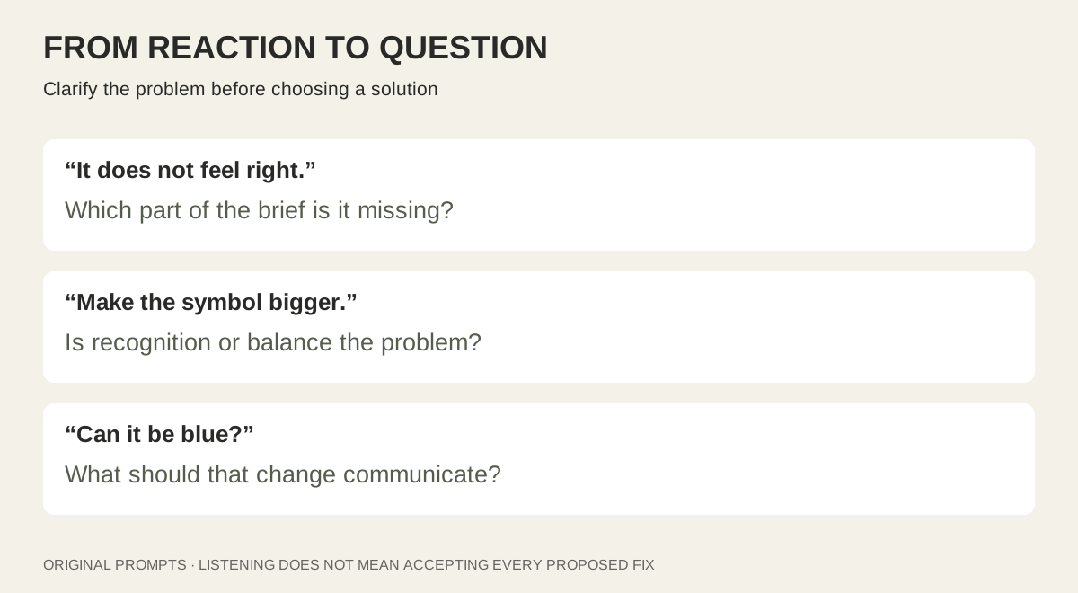
| We prefer another shade | Ask what the change should accomplish, then compare it in context |
Ask for observations before requesting solutions
‘Which do you like?’ is easy to answer but difficult to act on. Ask what the design communicates, where it fails and which part of the brief is not yet convincing. Personal taste is still information; it simply needs context.
If someone asks for a larger symbol, clarify the problem first: is the name too dominant, is the symbol unrecognizable, or is the layout unbalanced? Their suggested fix may be useful, but understanding the reason gives you more than one way to solve it.
For a live review, let people see the whole comparison before settling on changes. For an asynchronous review, put the decision question and response deadline in the document itself. Do not rely on your spoken explanation being remembered or forwarded correctly.
- What would a new customer assume this organization does?
- Which direction best matches the agreed character, and what in the design creates that impression?
- Where does it become difficult to recognize or read?
- What concern must be resolved before we develop this direction?
Use case studies to study explanation—not to borrow proof
Pentagram's published MoN Takanawa case study connects a recurring-time idea to a spiral mark and a wider layout and motion system. It is a useful example of explaining how a visual decision extends beyond a standalone logo.
That public case study is not evidence of what the designers showed in their first client meeting. Study the connection between premise and application; do not imply that you have seen their private deck or that using a similar narrative guarantees the same outcome. The teaching diagrams in this article are original and do not reproduce that identity.
Further reading: Pentagram: MoN Takanawa identity case study
End with a record of the next decision
A productive review ends with something another person can read tomorrow. Record the chosen direction, unresolved concerns, agreed refinements, who consolidates feedback and when the next review happens. If no direction is selected, say so; do not describe a polite reaction as approval.
Only move into final asset preparation after the artwork and relevant variations are approved. Keep presentation mockups and rejected concepts out of the final delivery folders. This separates selling an idea from equipping the client to use a finished identity.
- The review stage and decision are stated at the start.
- Every concept shown is viable and fits the agreed scope.
- The concepts receive comparable artwork and application views.
- Design intentions are not presented as tested audience results.
- Provisional details and production limits are labeled.
- The decision, outstanding questions and next review are documented.
Should I send the deck before the meeting?
Choose deliberately. Advance reading can help a distributed team, but the file needs enough context to stand alone. If you present live first, send the decision record afterward so feedback is not based only on memory.
Can I present sketches instead of polished logos?
Yes, if the client understands that you are reviewing early ideas and the agreed process includes that stage. Do not ask them to approve final execution from sketches or surprise them with a level of finish they were not expecting.
Should every concept have a complete identity system?
Not necessarily. Show enough of the relevant system to judge the direction within your scope. Label exploratory applications and avoid implying that uncommissioned deliverables are included.
Direction: develop Open doorway
Keep: invitation idea and practical character
Investigate: name readability on the timetable
Not approved yet: final spacing, colors and small-use variant
Feedback owner: one named client contact
Next review: confirm the revised mark in the same three applications
PUT IT INTO PRACTICE
Ready to prepare your pack?
logopack.app turns existing SVG artwork into an organized logo package. Preview your files, choose the available export options and check the result before handing it over. Exporting your own logo or icon files requires Pro.
Start with the logo pack generator, explore the sample ZIP, or compare the current plans.
Open generator