Design process & identity
Brand moodboards: turn references into an identity direction
A useful reference board does more than show your taste. It explains what to explore, why it fits the brief and what not to copy.
The short answer
Give every reference a specific job. Name the quality you want to investigate, translate it into an original design experiment and compare the result against the brief. A moodboard is a direction-setting tool, not a finished identity or proof that a design is original.
1. Start with a decision, not a search term
A board full of attractive images can still leave you unable to draw the first useful idea. The missing piece is often a decision: what should this identity help its audience understand? Write that before searching for a visual style.
For this article, imagine a fictional neighborhood repair workshop. It wants first-time customers to feel that repairs will be explained clearly and that worn objects are worth keeping. Its identity must work on a small storefront, service tickets and a mobile booking page. “Modern and friendly” alone does not describe that job.
Turn the brief into a question: how could an identity make an unfamiliar repair process feel understandable without looking disposable or improvised? A reference belongs on the board if it helps you explore that question. It does not need to look like the final logo.
2. Keep the category audit separate from inspiration
A competitor audit records what already exists: names, symbols, type styles, color conventions and recurring claims. Its job is to reveal context and possible confusion. An inspiration board explores ways to express your own direction. Combining them without labels can make category habits look like design instructions.
Look outside logo galleries as well. A repair ticket may suggest information hierarchy; a well-organized tool drawer may suggest a modular system; the rhythm of a shopfront may suggest repetition and interruption. These observations still need an argument connecting them to the brief.
In a D&AD jury interview published on 30 September 2026, Alex Center describes saturation in retro-style typography and discusses Bottega’s identity drawing on sunlight in the café. Our takeaway is not “make everything maximalist.” It is to look for a project-specific source before borrowing the latest category aesthetic.
Further reading: D&AD: a juror’s observations on differentiation and Bottega
3. Give each reference a job—and a limit
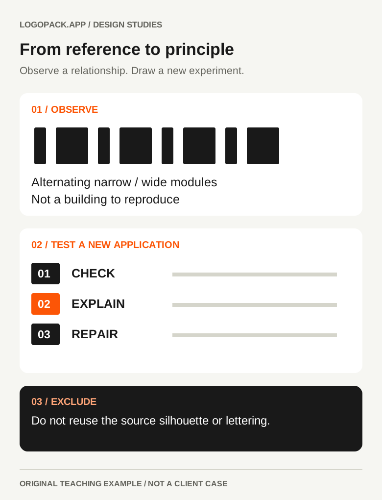
Annotate the feature you are studying, not just the name of the object. “Alternating narrow and wide modules” is more useful than “nice building.” It suggests an experiment you can draw without recreating the building or importing its whole visual language.
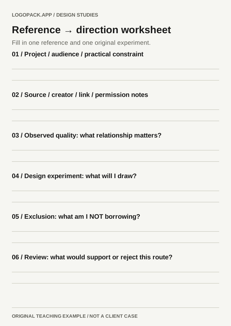
Use four short fields: source, observed quality, experiment and exclusion. The source lets you return to the original context. The exclusion says what is outside the idea: perhaps the reference’s silhouette, lettering, illustration or palette. It prevents “we like the rhythm” from quietly becoming “copy the whole composition.”
This is a design discipline, not a legal test. Keeping source notes or combining references does not by itself grant permission to reuse artwork or establish originality. Check usage rights separately for material you intend to reproduce or deliver.
Further reading: Figma: adding commentary to a moodboard
4. Make the directions differ in their organizing idea
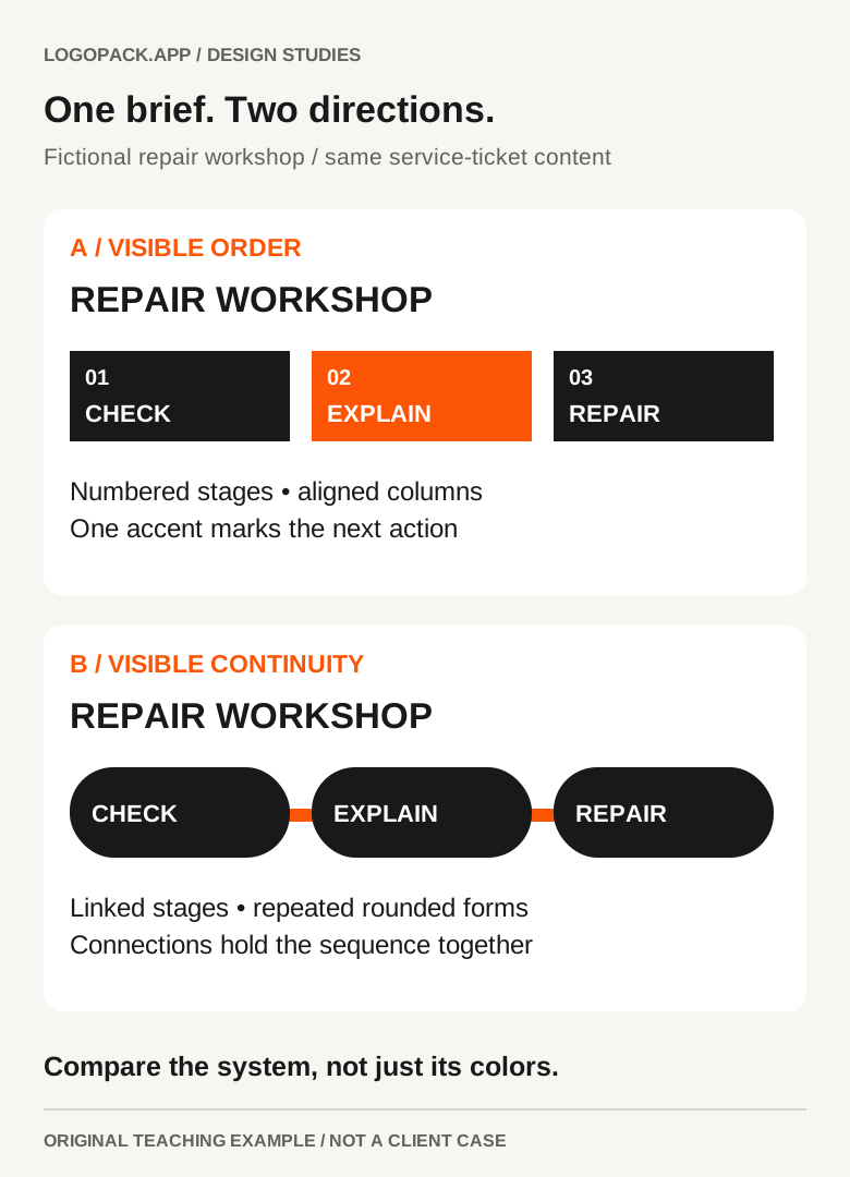
Try two routes for the same brief. This is a manageable comparison exercise, not a rule that every project needs two concepts. Both routes must answer the same audience and practical constraints; a knowingly unsuitable option is not a useful comparison.
For the repair workshop, route A uses visible order: numbered stages, consistent alignment and a restrained accent that highlights the next action. Route B uses visible continuity: connected forms, rounded modules and a repeatable linking device that suggests keeping an object in use. Those are different hypotheses about how to make repairs approachable.
A palette swap is not enough to establish another route. Compare the hierarchy, shape logic, typographic behavior and use of imagery. If both boards imply the same decisions in all four areas, you may have one direction with two surface treatments.
Milanote’s guidance recommends separate boards for different directions. The useful principle is separation: a viewer should be able to describe each route without accidentally borrowing its strongest features from the other.
Further reading: Milanote: separating moodboard directions
5. Test the idea in something you draw
A reference board can borrow polish from someone else’s finished work. Before asking a client to choose a direction, make a small original study that exposes whether the idea can survive without those images.
Use the same content and placements for each route. For our workshop, that means a compact name study, a service ticket and a mobile booking header. Keep them deliberately rough enough to revise. Do not give one route a beautiful storefront mockup and the other an unstyled wordmark, then treat the preference as an even comparison.
Project Everyone’s September 2026 account of its new Pentagram identity describes handwriting-inspired connections in the letters, with curves carried into the wider system. It is a useful real example of one idea appearing in more than one element. The lesson is continuity of reasoning, not a reason to imitate its lettering.
If a route only works while its reference imagery is visible, it is not ready to become your design direction. Return to the observed quality and try another experiment. A failed translation is useful information, not a reason to add more decorative references.
Further reading: Project Everyone: the idea of connection across its identity
6. Ask for feedback that changes a decision
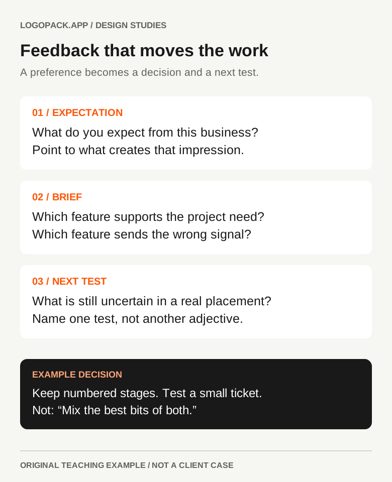
“Which board do you like?” often produces a preference with no design consequence. Ask people to explain what they expect the business to be like from each route, and what in the board or study creates that expectation. Compare those descriptions with the actual brief.
A client conversation can reveal assumptions and preferences; it is not a substitute for research with the intended audience. If a direction depends on a claim about recognition, trust or behavior, name that uncertainty and plan a suitable test rather than treating internal approval as proof.
Record the reason for the decision in plain language. “Choose A because the service stages are clearer; test B’s linking device separately before combining systems” is actionable. “Use the best bits of both” leaves the system unresolved.
What does this direction make you expect?
Look for concrete expectations about the service, not only adjectives such as premium or cool.
Which part supports the brief—and which part contradicts it?
Point to a feature or relationship that can be kept, changed or removed in the next study.
What still needs to be tested in a real placement?
Identify an uncertainty: a small sign, a long service name, a dark background or a multilingual label.
7. Keep the reasoning; clear the reference baggage
Save the chosen direction with its brief, source links, annotations, original studies and decision notes. Keep the unchosen route clearly marked rather than leaving two apparently current versions. A collaborator should understand what has been decided without replaying the presentation.
Before producing final brand assets, separate references from deliverables. Use original work or material with appropriate permission; confirm the relevant font and asset licenses for the actual use. A screenshot on an internal board is not automatically a licensed image for a client website.
The worksheet below gives one reference and one experiment enough space to be specific. Repeat it only for references that change a decision. More pages are not evidence of a stronger direction.
Further reading: Open the printable reference-to-direction worksheet
8. Stop collecting when the next experiment is clear
A useful board does not need to contain every influence. Stop adding images when the team can explain the direction, identify the decisions it implies and name the next original study. Reopen research when a specific uncertainty appears, not because there is empty space on the board.
You can also skip a formal moodboard when sketches, material samples or a written direction communicate the problem better. The deliverable is a clearer design decision, not a collage for its own sake.
- The direction answers a specific audience and project need.
- References have a stated purpose and traceable source.
- Competing directions differ beyond color or styling.
- At least one original application tests the proposed idea.
- Feedback identifies decisions and unresolved questions.
- Reference material is not mistaken for approved final artwork.
PUT IT INTO PRACTICE
Ready to prepare your pack?
logopack.app turns existing SVG artwork into an organized logo package. Preview your files, choose the available export options and check the result before handing it over.
Start with the logo pack generator, explore the sample ZIP, or compare the current plans.
Open generator