Brand identity craft
Monogram logo design: combine initials without losing readability
The cleverest way to join two letters is not always the clearest way to identify a brand.
The short answer
Choose the initials and decide whether viewers need to read them immediately or recognize a symbol alongside the full name. Explore a few letter relationships, preserve the features that distinguish each letter, and test the mark without explaining it first. Approve the reading, silhouette and small-size behavior before packaging the artwork.
1. Decide what people must recognize
Write down the exact initials, their order and the full brand name before drawing. A compact mark for a familiar organization has a different job from a new consultant's initials on an unfamiliar profile. Decide whether the letters must be readable on their own or whether the mark will normally appear with the name.
A monogram can combine letters into a distinctive symbol without making every letter equally obvious. That is a deliberate identity decision, not a reason to ignore accidental readings. If the brief requires an H and an N, a mark consistently read as an M has not met that part of the brief, even if it is attractive.
Start with a neutral version of the initials and keep it beside the sketches. It gives you a comparison for letter order, missing features and unnecessary complexity. Choose a type style or drawing approach that fits the brand; do not begin by forcing the initials into a fashionable shape.
Further reading: Adobe: an introduction to creating a monogram
2. Explore relationships before merging paths
Sketch several arrangements with the same initials: separate but closely spaced, sharing a stroke, interlocking, stacked or using one letter's open space. Change the relationship rather than producing dozens of nearly identical decorations. Not every pair has a convincing shared stroke, and a simple arrangement can be the strongest answer.
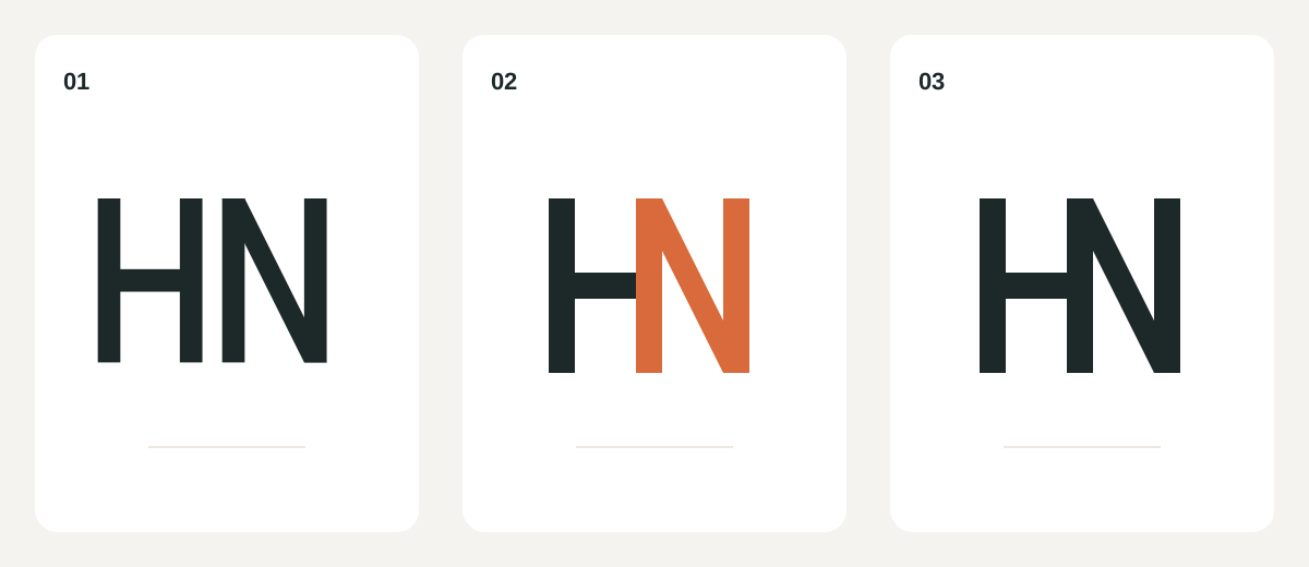
Our fictional HN exercise starts with two separate letters. Their adjacent verticals can become one shared stem while the H keeps its crossbar and the N keeps its diagonal. The diagram explains a construction option; it does not establish that every viewer will identify the result correctly.
Keep the parts editable while comparing candidates. Once a relationship works, use the vector editor's shape operations on a duplicate to remove redundant overlaps. In Illustrator, Shape Builder can merge selected overlapping regions or remove them. Inspect the resulting edges and counters rather than assuming a successful merge means the design is finished.
Further reading: Adobe: combine or remove regions with Shape Builder
3. Protect the features that identify each letter
Look for the small features doing the most work: a crossbar, a diagonal, an open counter or the direction of a terminal. Joining two letters can remove exactly the feature that distinguishes one from another. Compare each candidate with the neutral initials, then hide the reference and inspect the mark again.
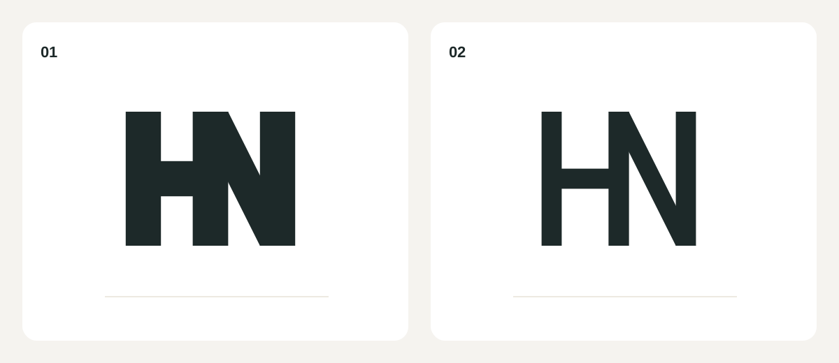
Check the empty spaces as carefully as the strokes. When intersections become dense, a counter can close or a third shape can dominate. Try a wider opening, a lighter join or a different overlap before adding more detail. Do not rely on two colors to separate letters that also need to work in one color.
A monogram can also come from a specific story rather than a geometric trick. Jane Austen's House explains that its J and A mark was developed from Austen's handwriting. The relevant lesson is to choose source material connected to the identity, not to borrow that mark's contours or assume its proportions will suit another pair of initials.
Further reading: Jane Austen's House: the handwriting behind its monogram
4. Test the reading before explaining the idea
Show a candidate without its initials written above it. Ask a few people who have not watched the design process what letters or shapes they see, and record their first answers before discussing the concept. This is a practical design check, not a statistically reliable recognition study.
Then show the intended name-and-symbol combination and ask again. If the mark works only after a detailed explanation, decide whether that dependence fits the brief. A learned emblem beside the full name may be appropriate; a supposedly self-explanatory abbreviation may need another iteration.
Review repeated misreadings, unexpected symbols and unclear reading order. Rotate or mirror the mark only as a diagnostic check for unintended associations, not as an approved use. Review similar marks in the relevant market too. A small feedback group cannot establish distinctiveness or provide trademark clearance.
- The intended initials and reading order are documented.
- Feedback was collected before revealing the answer.
- Recurring alternative readings have been addressed or deliberately accepted.
- The symbol works with the full name in its intended context.
- Similarity research is separate from visual approval.
5. Compare real sizes and positive and reversed versions
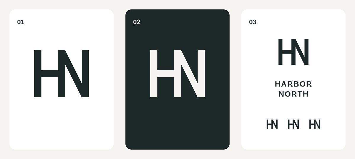
Place the shortlist in the smallest important use and one larger application. Export representative files and inspect them at the destination's actual display size. A responsive illustration inside this guide cannot prove that a monogram will survive as a favicon, avatar, stamp or embroidered mark.
Test dark artwork on a light background and approved reversed artwork on a dark background. Look for joins that fill in, strokes that disappear and openings that seem unequal. If a small-use version is necessary, simplify the construction deliberately and test it again; do not let a supplier improvise a different symbol.
Also check the monogram beside the full name. Match their visual weight and spacing without assuming they need identical stroke widths. Document when the monogram may stand alone and when the name must accompany it. Set minimum size from the tested applications, with separate production advice where a supplier's process requires it.
6. Package only the approved monogram versions
Keep the exploratory lettering and editable source separate from ready-to-use files. Prepare a clean master for each approved version, checking bounds, unwanted overlaps, transparency and any live text. Keep a record of font licensing and the agreed source-file handoff where those apply.
Before building your package in logopack.app, make a short version list: the monogram, its approved name lockup, and any separately approved small-use or reversed artwork. Resolve the lettering first, then package the finished artwork. Exporting more files does not make an ambiguous monogram easier to read.
For a practical handoff check, use the linked client-file checklist to choose the needed formats, then open representative delivered files in their destination apps. Add a short instruction saying when the initials may appear alone. That connects the design decision to the file the client will actually choose.
PUT IT INTO PRACTICE
Ready to prepare your pack?
logopack.app turns existing SVG artwork into an organized logo package. Preview your files, choose the available export options and check the result before handing it over. Exporting your own logo or icon files requires Pro.
Start with the logo pack generator, explore the sample ZIP, or compare the current plans.
Open generator