Logo design
Negative space in logo design: make the gaps work
Shape the empty parts as carefully as the filled ones. A hidden picture is optional; a readable mark is not.
The short answer
Start with a strong silhouette, draw the important gaps as deliberate shapes, and test them in the intended applications. Compare a few controlled variations before adding more detail. Use real cutouts, rather than white patches, when the background should show through.
1. Decide what should read first
Negative space is the unfilled area inside and around a shape. It includes the counter inside a letter, the opening in a symbol and the space between two parts. It does not have to contain a second illustration to be useful.
Write one sentence about the mark's first job. For an imaginary neighborhood venue, our exercise is an open doorway inside a compact arch. The arch should read first; the doorway should remain clear. This is an original teaching example, not a client identity or a claim that an arch is a unique trademark.
Fill the mark with one color and hide the name. If its outer shape is already confusing, adding a face, initial and arrow inside it is unlikely to help. Try removing one idea and compare the silhouette again.
2. Compare the gap, not three different logos
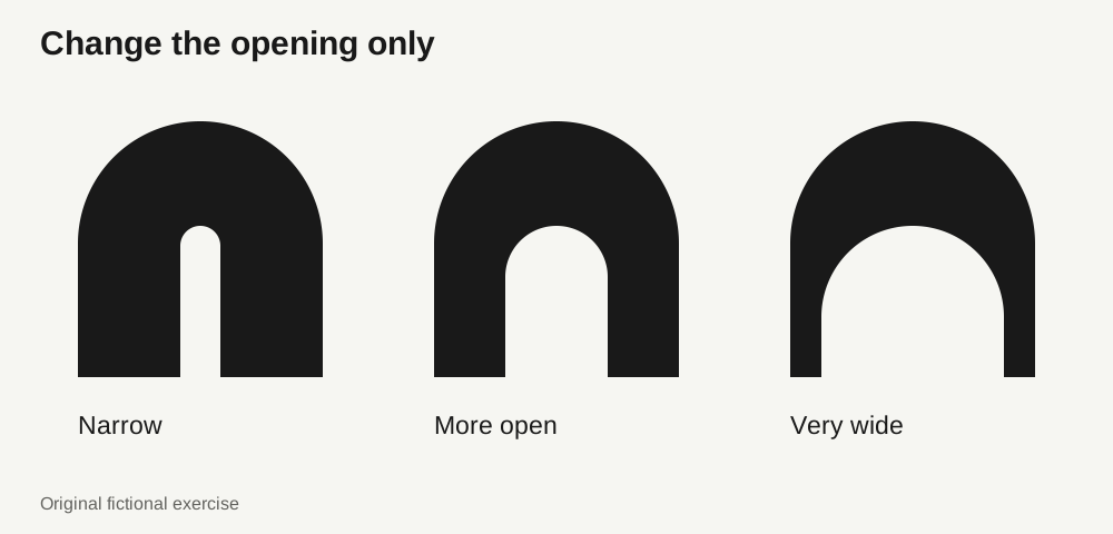
Duplicate the same silhouette three times. Keep its height, width and outside contour fixed. Change only the opening: narrow, more open and very wide. This makes it possible to judge the effect of that decision instead of being distracted by unrelated differences.
In the arch exercise, the narrow doorway leaves a heavy block; the wide one reduces the side supports. The middle version is a useful next candidate, not a mathematical winner. Judge how the filled and empty areas share attention, then refine the shape for its actual context.
Look for near-touches where two edges almost meet. Either separate them clearly or join them deliberately. Do not impose one gap value everywhere: a curved opening and a diagonal opening can look different even when a ruler reports the same distance.
3. Make empty space genuinely empty
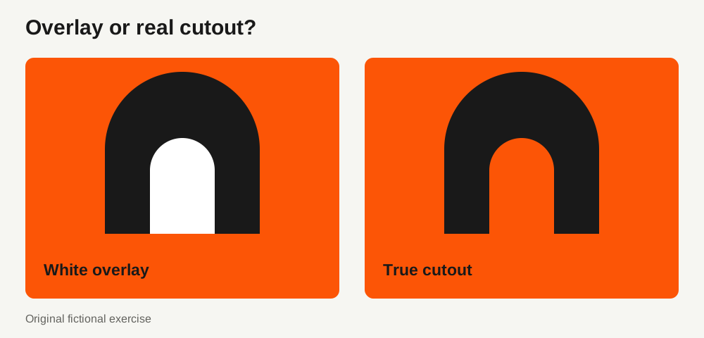
A white object placed on top of a dark symbol can look like a hole on a white artboard. Put the same artwork over a colored background and the white object becomes visible. When the background is meant to show through, build a real cutout.
In Illustrator, keep a copy of the editable source, place the cutting shape above the main shape, select both and use Minus Front in the Pathfinder panel. Adobe documents this as subtracting the frontmost objects from the backmost object. Check the result rather than assuming the tool chose the intended areas.
For an opening enclosed within a shape, a compound path is another option. A compound path and a group are different structures. After exporting, inspect the actual SVG over both a pale background and a colored one; do not rely only on the Illustrator artboard.
Further reading: Adobe: Pathfinder panel options · Adobe: create compound paths
4. Test the mark where it will live
Put the candidate in a real avatar, website header and document footer. Use the intended display dimensions and inspect it without zooming in. A large preview cannot tell you whether an opening survives in a small icon. Export and inspect the file in its destination too, because rasterization and the surrounding layout affect what you see.
Use the same application for each candidate. If an internal detail becomes hard to distinguish, try opening that gap or removing the least useful detail in a separately approved small-size version. Keep the recognizable outer shape. Do not treat a fixed pixel size or minimum stroke width as a universal rule for every logo.
Google's published identity case study describes increasing the visual weight of its compact G for small contexts. The useful lesson is to test a size-specific drawing when necessary, not to copy Google's proportions or automatically simplify every mark.
Further reading: Google Design: a compact mark for small contexts
5. Review both the shape and the background
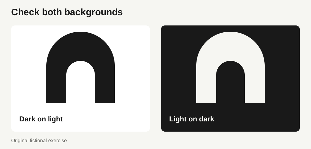
Show the mark dark on light and light on dark at the same size. The background should pass cleanly through every intended opening. Check that the reversed version still has the same character; approve an optical adjustment separately if it is needed.
Ask someone who has not seen the construction to describe the first shape they notice before you explain the idea. If a secondary image matters to the brief, ask about it afterwards. This is a quick design review, not a recognition study or proof of commercial effectiveness.
Record the approved main and small-size versions, their intended uses and any background restrictions. Keep the editable construction separate from the final assets. The next designer should not have to rediscover which version was chosen.
- The outer silhouette is understandable without an explanation.
- Important gaps remain distinct in the intended applications.
- Intended cutouts reveal the background in the exported file.
- Positive and reversed versions have been reviewed separately.
- Any small-size version has its own approved use and filename.
Common questions
Does a negative-space logo need a hidden symbol?
No. A clear counter, opening or separation can do useful work without depicting a second object. Add a second reading only when it helps the brief and does not weaken the main shape.
Should every gap be the same width?
No. Consistency of visual rhythm matters, but curves, diagonals and surrounding mass change how a gap appears. Compare controlled alternatives in context rather than applying one measurement everywhere.
Can LogoPack fix the shape automatically?
Refine and approve the artwork in your design tool first. LogoPack helps prepare assets from existing SVG artwork; exporting a package does not replace judging the design or testing it in use.
PUT IT INTO PRACTICE
Ready to prepare your pack?
logopack.app turns existing SVG artwork into an organized logo package. Preview your files, choose the available export options and check the result before handing it over. Exporting your own logo or icon files requires Pro.
Start with the logo pack generator, explore the sample ZIP, or compare the current plans.
Open generator