Brand identity craft
Create a seamless brand pattern from a logo motif
A repeated logo is a starting point. A usable pattern also needs rhythm, clean joins and a clear place in the identity.
The short answer
Choose an approved motif and define where the pattern will be used. Build one repeat unit, inspect it in a larger tiled field, and test its scale and contrast in real layouts. Deliver the editable pattern separately from ready-to-place artwork, with simple rules for backgrounds, cropping and text.
1. Give the pattern a job before choosing a shape
Decide whether the pattern belongs on packaging, a presentation divider, a social template or another specific surface. A quiet background behind information needs a different density from decorative wrapping. Write down the first two uses and a use you want to avoid.
Start from an approved symbol, a distinctive curve or a related original shape. Keep an unchanged master of the logo. Cropping, rotating or recombining a motif creates a supporting graphic; it does not automatically become an approved new logo variant. Agree those uses as part of the identity.
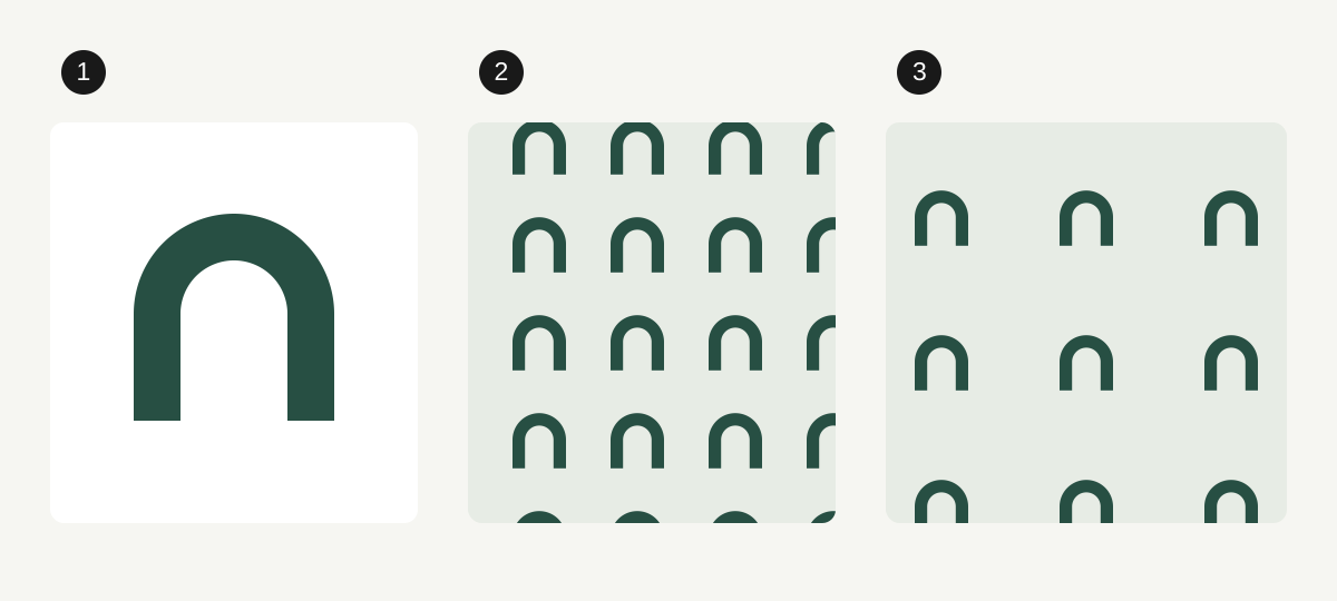
Our examples use an original fictional arch motif. The numbered diagrams show construction choices, not client work or a tested brand. A pattern does not need to contain the entire wordmark to feel related to the identity.
2. Separate motif size from repeat spacing
The motif is the artwork. The tile is the area that repeats. Enlarging the tile while leaving the motif unchanged increases the space around each instance. Enlarging both together changes the overall scale without changing the density within the tile.
Compare a few deliberate arrangements using the same motif: a straight grid, a staggered arrangement, or alternating orientations. Look across several repeats. Rows can form unintended stripes, gaps can become distracting shapes, and rotated parts can suggest a different symbol. Choose the rhythm in the whole field rather than judging one attractive tile.
In Illustrator on desktop, select the motif and use Object > Pattern > Make. The pattern becomes a swatch. Use Pattern Options to compare tile type, width, height, spacing and overlap; turn on tile edges while inspecting the construction. Save with Done when the comparison is ready. Interface labels can vary with language and version.
Further reading: Adobe: create and apply patterns · Adobe: edit pattern tile settings
3. Check the joins in a larger field
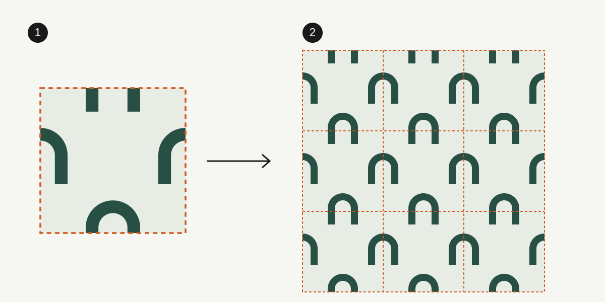
For a simple rectangular repeat built by hand, anything crossing the left edge must continue at the same vertical position on the right edge. Copy it by exactly one tile width. Use the same principle for the top and bottom edges, copying by one tile height. A motif crossing a corner needs matching copies across both axes.
Keep the tile dimensions fixed while making those copies. Do not align edge fragments by eye or crop the tile independently afterward. This rule describes a simple rectangular repeat; a staggered pattern needs its own repeat structure or the pattern tool’s tile handling.
Inspect at least a three-by-three field so the middle tile has neighbors on every side. Check with boundaries visible, then hide them and inspect the rhythm. Reopen the exported tile and repeat that file too: an extra transparent border, an altered crop or a one-pixel size change can spoil an otherwise correct master.
Further reading: MDN: how SVG patterns repeat a tile
4. Test scale, cropping and text together
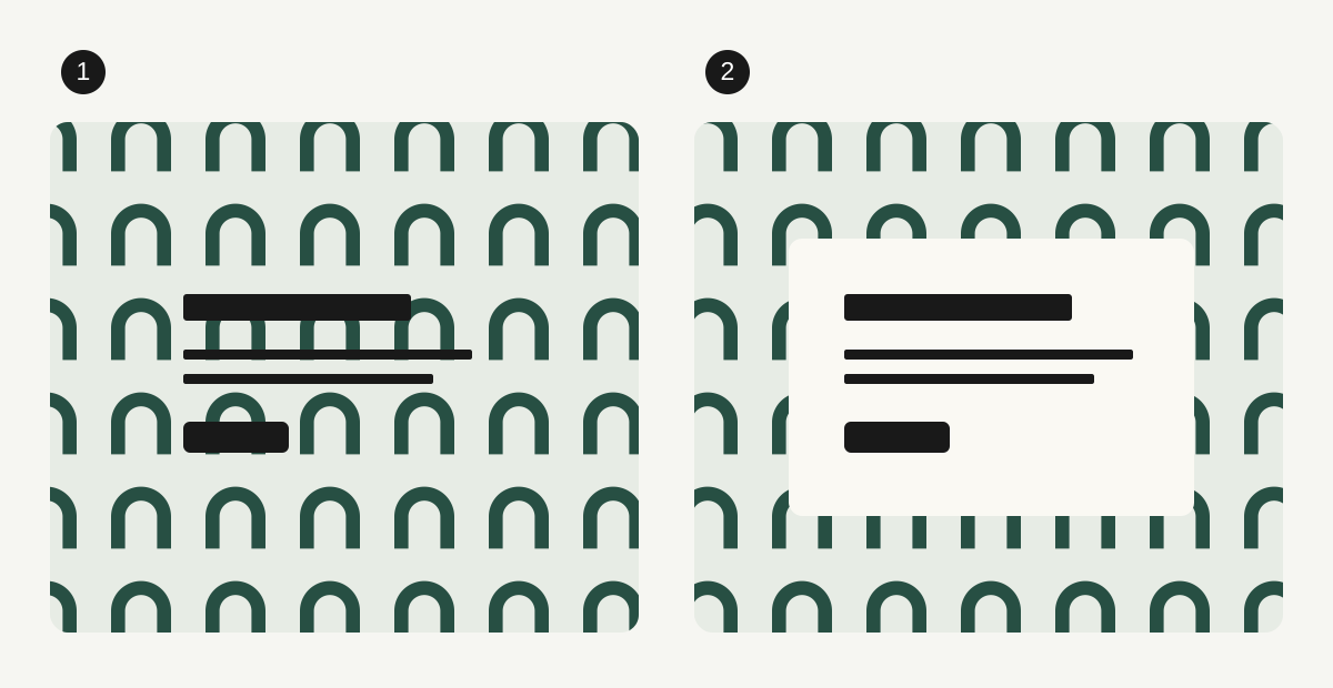
Place the pattern in the actual layout, then inspect it at the intended screen or print size. Try a narrow crop as well as a large area. A repeat that looks balanced across a whole sheet can leave an awkward half-motif beside a heading or become visual noise in a small card.
Give important content a quiet area. In the third diagram, the right-hand card separates the information from the busy field. Other treatments can work, but lowering opacity alone does not prove text will remain readable over every part of a pattern.
For digital text, check the actual foreground and every relevant background behind it. WCAG’s usual minimum is 4.5:1 for normal text and 3:1 for qualifying large text. The logo exception does not exempt surrounding headings, instructions or button labels. Use a solid panel when the changing background makes reliable contrast difficult.
Further reading: W3C: text contrast requirements and exceptions
5. Deliver a pattern the next person can actually use
Ask what the recipient will edit. An Illustrator swatch is useful to someone working in Illustrator; it is not a universal background file. A web developer may need a repeating tile with its display size specified. A client making slides may need a finished background in the correct aspect ratio instead.
Keep the editable master and the ready-to-place outputs separate. Test the chosen format in the destination application: an SVG can contain a live pattern definition, and not every importer preserves every SVG feature. A preview in your own editor is not proof that the client’s tool will reproduce it.
For print, confirm the supplier’s color and production requirements and request a proof when necessary. The seamless tile is not the same as a finished print layout with trim and bleed. Preserve the editable pattern rather than expanding every instance in your only master.
| Next task | Useful deliverable | Check before sending |
|---|---|---|
| Edit the motif or repeat | Native editable file with the named pattern swatch | The swatch is present and changes update the intended artwork. |
| Repeat a web background | Tested tile plus intended display dimensions and background color | Edges join at the actual display scale; the exported file repeats correctly. |
| Place a slide or social background | Finished composition at the agreed dimensions | Cropping, quiet text areas and destination-app rendering. |
| Produce printed packaging | Supplier-ready layout and agreed source assets | Production specification, scale, color and any required proof. |
6. Record the few rules that prevent misuse
Show one approved example and one clear misuse that matters for this identity. Record the motif, allowed arrangements, color combinations, useful scale range and where text can go. Use project-specific tests to set those rules; do not invent a universal minimum pattern size.
Label a repeating tile differently from a finished background so nobody stretches the tile across a whole page by accident. Include its repeat dimensions, approved colors and one preview of the complete field. If a later revision changes the tile, replace the corresponding exports and update the version together.
Keep the pattern in the supporting-assets part of the brand handoff. Use logopack.app for the approved logo artwork and its logo package; prepare and verify the repeating pattern in your design tool. A pattern-design or seamless-tile export feature is not implied by the logo generator.
- The motif and permitted transformations are approved.
- Tile edges match in a multi-tile field and in the exported file.
- Narrow and wide crops work at the intended size.
- Real text remains readable on every approved background treatment.
- Editable source, repeating tiles and finished compositions are clearly distinguished.
- The recipient can open and use representative files in the intended application.
PUT IT INTO PRACTICE
Ready to prepare your pack?
logopack.app turns existing SVG artwork into an organized logo package. Preview your files, choose the available export options and check the result before handing it over. Exporting your own logo or icon files requires Pro.
Start with the logo pack generator, explore the sample ZIP, or compare the current plans.
Open generator