Brand identity
How to build a usable brand color palette
Give every color a job, then show which combinations work in real layouts.
The short answer
Start with the applications the client needs. Define roles for text, surfaces and accents, test the actual color pairs, and document approved uses with examples. Keep the approved logo artwork separate from supporting interface colors.
1. Start with applications, not a swatch count
A row of five attractive colors leaves several decisions unanswered. Which one carries a paragraph? What sits behind it? Can the client use the accent for a booking button or a chart label? Start by listing the first things the identity must support: a menu, a small website, packaging and a presentation, for example.
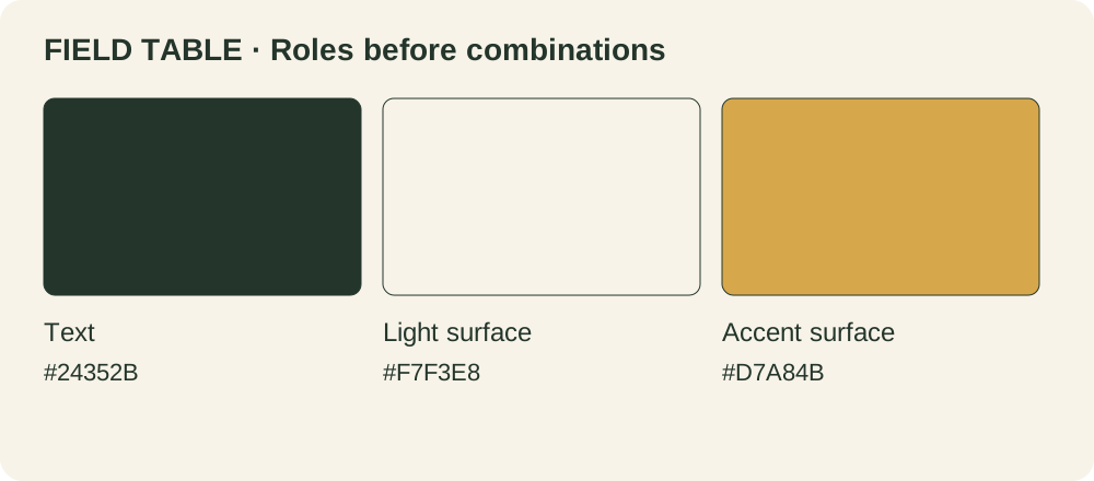
For this fictional exercise, Field Table is a neighborhood café. Its palette contains Forest #24352B, Oat #F7F3E8 and Harvest #D7A84B. These invented examples demonstrate a specification method. They are not a ready-made identity or a universal recipe.
Collect a few real pieces of copy before choosing supporting tones. A long opening-hours note and a price are better tests than a decorative word on an empty artboard.
2. Give the colors specific roles
Write roles beside the values. Forest is the default text color, Oat is a light surface, and Harvest is an accent surface. Those descriptions are more useful than “color 1,” “color 2” and “color 3.” A role can have different values in different contexts, but every variation should be intentional and documented.
USWDS provides a public example of theme colors organized by roles. Borrow the idea of naming a purpose, not its specific government palette. For Field Table, a short role sheet is enough; there is no reason to prescribe a fixed number of colors or a universal percentage split.
Keep identity accents separate from semantic colors for errors, warnings and success. A warm brand accent is not automatically a warning, and a green brand color should not be the only cue for success. Name and document those roles separately when the client needs an interface.
Further reading: USWDS: theme color tokens · USWDS: state color tokens
3. Test foreground and background together
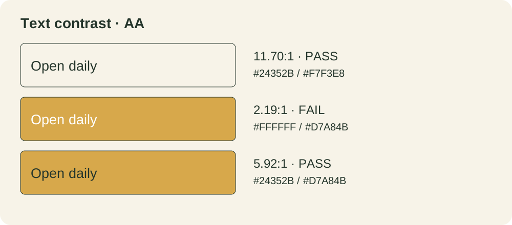
Contrast belongs to a pair of colors in use. In the matrix below, all colors are opaque sRGB values on flat backgrounds. Ratios were calculated from relative luminance; displayed numbers are rounded for readability, while pass or fail uses the unrounded value.
For WCAG AA text contrast, the minimum is 4.5:1 for ordinary text and 3:1 for large text. Large means at least 18 pt (24 CSS px), or 14 pt bold (about 18.7 CSS px), at the rendered size. Check the text in its actual application, not only the point setting in a design file. Do not round a near miss up to a pass. These checks cover text contrast only.
| Text | Background | Ratio | Ordinary text |
|---|---|---|---|
| #24352B | #F7F3E8 | 11.70:1 | Pass |
| #FFFFFF | #D7A84B | 2.19:1 | Fail |
| #24352B | #D7A84B | 5.92:1 | Pass |
| #647467 | #F7F3E8 | 4.47:1 | Fail |
| #FFFFFF | #24352B | 12.97:1 | Pass |
Further reading: W3C: text contrast
4. Separate the mark from supporting colors
The logotype exception does not exempt ordinary branded copy. Keep the approved logo artwork and its placement rules distinct from text, buttons and navigation.
In our example, white writing on Harvest is difficult to distinguish. Forest writing on the same Harvest surface provides a stronger text pair. This repairs the supporting layout without silently changing the approved mark.
If a supporting tone needs to become darker, give the new value its own role and show where it is allowed. Do not replace every instance of an original brand color without reviewing the artwork and agreeing the scope.
5. Make a small specimen with real content
Lay out one menu section, an opening-hours card and a booking button. Use the same roles across all three. Then try a longer heading and a narrow mobile width. Check the actual type size and weight, not just a calculator result.
Where color communicates status or categories, add another visible cue such as a label or shape. A chart legend should identify each series clearly. Do not make a customer decode “green means available” with color alone.
Treat dark mode, photography, transparency and gradients as separate cases. A pair tested on a solid light surface says nothing about text over a moving image or a different background.
Further reading: W3C: do not rely on color alone
6. Hand over decisions, not just values
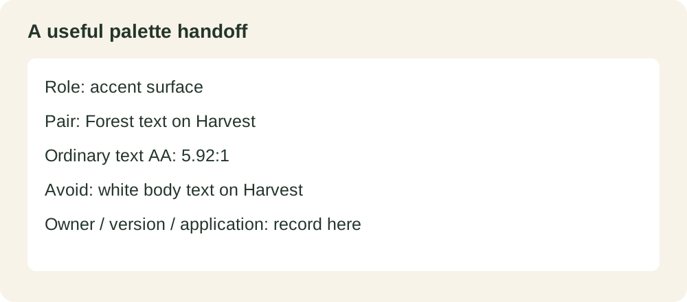
Include the color name, role, exact digital value, allowed foreground/background pair and one realistic example. Mark combinations that should not be used for ordinary text. Keep print production specifications separate and agree them for the actual stock, process and supplier.
The worksheet below gives a future designer somewhere to record a change and its reason. Package it alongside the approved logo files and the rest of the identity guidance. Do not describe an entire brand as “accessible” because several text pairs passed.
Version and owner: …
Application: …
Role and color value: …
Foreground / background: …
Type size and weight: …
Unrounded contrast and result: …
Allowed use and example: …
Restrictions and follow-up checks: …
Common questions
Does every brand color need to work as body text?
No. An accent can have a useful job as a surface or decorative element. Document where it can be used and pair it with suitable text.
Can I keep a light brand accent?
Often, yes. Try a darker text color on it, or reserve it for a role that does not depend on faint text. Verify the actual application.
Is a passing contrast ratio a complete accessibility review?
No. It evaluates a particular visual relationship. Navigation, meaning, interaction and other accessibility requirements need their own checks.
PUT IT INTO PRACTICE
Ready to prepare your pack?
logopack.app turns existing SVG artwork into an organized logo package. Preview your files, choose the available export options and check the result before handing it over. Exporting your own logo or icon files requires Pro.
Start with the logo pack generator, explore the sample ZIP, or compare the current plans.
Open generator