Bilingual logo design
How to align a bilingual logo when the two names have different widths
Balance unequal Arabic and English wordmarks without stretching either one. Compare three layouts and proof the result at real sizes.
The short answer
A long English name and a compact Arabic one don’t need to fill equal rectangles. Start by approving the wording in both languages, then compare both scripts at the size and on the surface where the mark will actually be used.
Set both names before deciding how to align them
Agree with the client whether each name is a translation, a transliteration, or a separate approved name. Have a fluent Arabic reader check the intended spelling before choosing a face. Keep both scripts editable while sketching. In Illustrator, use the appropriate composer and text direction for Arabic. Don’t reverse characters, mirror the Arabic lettering or add Latin-style tracking to force its width. Judge the letters as they actually join.
Further reading: Adobe Illustrator · W3C · Arabic & Persian Layout Requirements
Match presence, not the bounding boxes
Print or view both words in one color on the same background. Cover one word, then the other. Does either disappear first when you step back? Compare average stroke weight, density and the space around each word. Adjust size or choose a better weight; don’t stretch the narrower name to the width of the longer name. In the fictional NOUR / نور study the widths differ on purpose.
Make three layouts, then assign a job to each
Try a centered stack for a narrow face such as a label; align the visible shapes around a shared vertical axis, not their text boxes. For a wide sign, try side by side with a deliberate gap and optically align their visible centers. If the brief permits it, supply separate Arabic and English marks for language-specific layouts. Agree which script leads in each use rather than picking a universal order. Don’t mirror the finished marks when the UI direction changes.
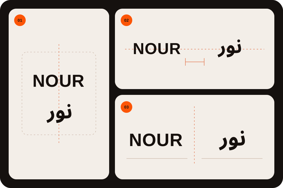
Proof the two scripts at the smallest real size
Compare the stack and the wide layout on a mock label and a header at their intended sizes, on light and dark backgrounds. Ask readers of both scripts to read the name back without prompting and see whether spacing or letter details disappear. If the combined mark fails where each script works on its own, approve a small-use alternative; don’t remove a language that is required. Record approved order, minimum size and placements, and hand off separate editable and outlined production copies if useful.
PUT IT INTO PRACTICE
Ready to prepare your pack?
logopack.app turns existing SVG artwork into an organized logo package. Preview your files, choose the available export options and check the result before handing it over. Exporting your own logo or icon files requires Pro.
Start with the logo pack generator, explore the sample ZIP, or compare the current plans.
Open generator