Typography
Check a brand font’s language support before approving it
A typeface can look perfect in an English moodboard and fail on the first customer’s name.
The short answer
Collect the brand’s real names, markets and recurring copy. Check the exact font files and styles against that material, then test them in the applications the client uses. A language label is a useful filter, not a substitute for a reviewed specimen. Keep spelling, glyph coverage and rendering problems separate.
1. Build the test text before choosing the font
Start with the approved brand name, product names, people, places, prices and short messages that will appear in the identity. Ask which languages are needed now and which launches are already planned. An English headline is not enough evidence for a European customer list.
Make a small specimen from that copy, not a page of random exotic characters. Include capitals, lowercase, punctuation, currency symbols and the styles you actually intend to use. Have someone fluent in each language approve the spelling before judging the typography.
- Record the language, the exact string, its placement and the person who can review it.
- Keep the wordmark test separate from editable headings, documents and customer-facing text.
Further reading: type.today multiscript typography
2. Check the exact font, not the family’s reputation
Use the foundry’s language list and character specimen to narrow the choice. Then test the actual file, weight and italic you plan to license and deploy. A familiar family name does not tell you which version is installed on a client’s computer.
Keep a note of the source and version. If one needed character is missing, compare an appropriate companion typeface or ask the foundry about support. Do not remove an accent to make the font pass: that changes the text, not the font’s capability.
Further reading: Swiss Typefaces multilingual solutions
3. Separate spelling, coverage and positioning
A missing-character box, a mismatched letter and a misplaced accent are different failures. First check that the text contains the intended character. Then check whether the selected font supplies it. Finally inspect how the letter and its marks sit together.
A breve and a caron are not interchangeable decoration. A mark that sits too far away can stop reading as part of its letter; one that collides can obscure the shape. Review real words at their intended size rather than approving a large isolated glyph.
- Wrong character: correct the approved text with a language reviewer.
- Missing character: change the font selection or obtain suitable support.
- Bad positioning: compare the same text in the intended app and ask the font vendor when necessary.
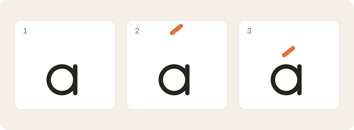
Further reading: Google Fonts diacritics
4. Test the application, not only the specimen
Paste the same reviewed strings into the website, slide template or document where they will live. Check small text, capitals and the chosen line spacing. Watch for an accent clipped by a tight box or a single character switching to a visibly different face.
For web projects, check the delivered character subset as well as the desktop font. Adobe’s documentation distinguishes a family’s support from the character set selected for a web project. A successful desktop preview does not by itself approve the deployed website.
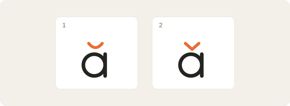
Further reading: Adobe language support and web subsets
5. Make the handoff explicit
Give the client a short coverage sheet: font family and version, approved styles, tested languages, applications and any intentional companion font. Attach the reviewed specimen and identify who approved the language. Avoid promising support for every possible name or future market.
An outlined wordmark preserves approved shapes, but it does not solve missing characters in the brand’s editable typography. Keep the live source and licensing instructions alongside the artwork, and follow the relevant font licence rather than assuming font files can be redistributed.
Before you approve the typography
Approve a usable system, not just a beautiful font preview. The brand name should read correctly, required copy should stay intact, and the client should know which fonts and versions to use. Recheck the specimen when a new language or font update enters the project.
- Real copy and spelling reviewed.
- Required characters present in each chosen style.
- Marks, spacing and clipping checked in final applications.
- Web subset and intentional fallback documented.
- Editable typography distinguished from outlined logo artwork.
PUT IT INTO PRACTICE
Ready to prepare your pack?
logopack.app turns existing SVG artwork into an organized logo package. Preview your files, choose the available export options and check the result before handing it over. Exporting your own logo or icon files requires Pro.
Start with the logo pack generator, explore the sample ZIP, or compare the current plans.
Open generator