Typography & identity
Font pairing for brand identity: roles before rules
Two attractive typefaces do not automatically make a useful identity. The relationship becomes clearer when each has a job.
The short answer
Start with the text your brand must carry, then assign roles: recognition, headlines, reading and details. Test one family before adding another. Judge a pair in actual layouts, at actual sizes, with the languages and content the client will use. A serif–sans combination is an option, not a guarantee.
Give the text a job before choosing its voice
Imagine a small reading room that hosts evening talks. Its identity has to introduce a speaker on a poster, explain a session on a phone and make the date and booking information easy to find. A single beautiful word on a specimen sheet cannot answer all three needs.
For this fictional project, write a role map before opening another font menu. The headline invites attention. The paragraph explains the event. The detail line carries time, price and location. The wordmark identifies the organization. One family may cover several roles; a separate family needs a reason to join.
This changes the review question from “do these fonts match?” to “can a reader tell what matters, and does the combination fit this particular place?” It also gives a client something more useful to discuss than whether a font feels nice.
| Role | Text to test | Decision to make |
|---|---|---|
| Recognition | The reading-room name | Does it remain distinct beside a headline? |
| Headline | A short and a long event title | Can it attract attention without breaking the layout? |
| Reading | A real event description | Can someone read it comfortably in the intended placement? |
| Details | 19:30 · Room 2 · €12 | Can readers find and distinguish the practical information? |
One family is a serious option
Before searching for a companion, make a version using one family. Change size, weight, spacing and placement deliberately. If the event title, description and booking line already have distinct roles, a second family might add character, but it is not required to create hierarchy.
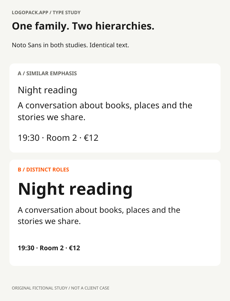
Compare the two one-family studies below. The first gives every line similar emphasis. The second lets the title lead and groups the practical information. The family has not changed. If you prefer the second, the useful discovery is a clearer arrangement, not a better pairing.
In an October 21, 2026 report, Muzli found the same family in headline and body roles on 60% of its curated 2,190-site sample. That is an observation about gallery-featured websites, not a rule for all identities or evidence that one family performs better. Our takeaway: include a one-family candidate rather than assuming two is the professional answer.
Further reading: Muzli: the sample and method behind its October 2026 report
Make the contrast do something
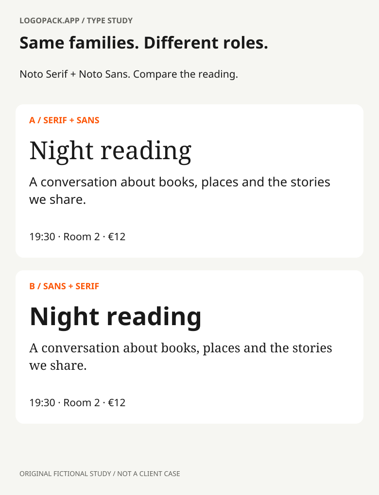
Now introduce a serif headline above the sans-serif paragraph. Keep the wording, available width and information order fixed. This makes it easier to judge what the new voice adds instead of giving one candidate the advantage of a better layout.
Look beyond the serif label. Compare the rhythm of the lines, the darkness of the paragraph, the width of the title and the shape of repeated letters. Two sans-serif families can work together; a serif and a sans can compete. The distinction that matters is the one visible in the actual composition.
The second comparison reverses the roles: Noto Sans leads, while Noto Serif carries the paragraph. Neither arrangement wins by definition. For the reading room, ask which supports the desired tone without making the booking details harder to find. Keep the answer attached to this brief, rather than turning it into a rule about every brand.
Further reading: Google Design: choosing type for project needs and testing combinations
The size field is not the visual size
Two fonts set to the same number can occupy different amounts of visible space. Compare the actual lowercase, capitals, stroke weight and line length. Do not stretch letters to make two families match; adjust the typesetting and check the result as a whole.
A headline specimen enlarged to fill your monitor tells you little about a small caption. Test the intended paragraph and detail sizes on the intended screen or a physical print. Check dark-on-light and reversed versions if both belong to the identity. A thin feature that looks elegant at poster scale may become fragile elsewhere.
Where a family offers optical sizes, inspect those too. Adobe’s explanation of Source Serif describes size-specific changes to proportions, spacing and details, not simply enlarged or reduced outlines. This is a capability to check in the chosen font and application, not something every variable font automatically provides.
Further reading: Adobe: what optical sizes change in Source Serif
Use the awkward content, not only the attractive words
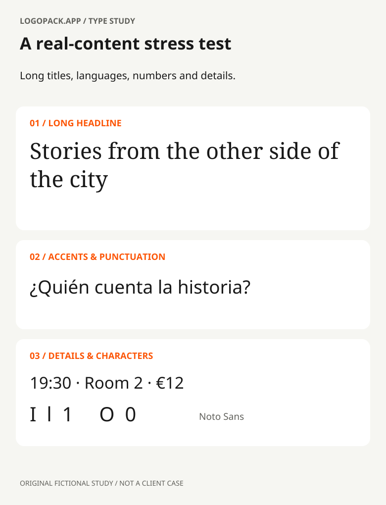
A pairing can survive a short English headline and fail the first real event title. Build a small stress sheet using the client’s content: their longest name, a two-line heading, a paragraph, a price and the languages they actually publish. Keep the design roles stable while the words change.
For our reading-room study, “Night reading” becomes “Stories from the other side of the city.” The point is not that the longer title must remain on one line. It is to decide whether its wraps, spacing and relationship to the paragraph still feel intentional. Do not solve every difficult title by shrinking everything.
Include accents, punctuation and numerals. A working Spanish sample such as “¿Quién cuenta la historia?” reveals more than an alphabet alone. Check required scripts with a fluent reader and verify the actual font files; the presence of one accented word does not prove complete language support. For functional labels, inspect easily confused characters in context rather than declaring a font accessible from its style.
The wordmark does not have to set the paragraph
A logo is a compact identifier. Its lettering may be drawn, modified or tightly composed for one name. Body text has to handle new sentences every day. Reusing the wordmark’s most distinctive feature everywhere can turn a useful signature into visual noise.
Place the actual wordmark beside a realistic headline and paragraph. If they compete, try changing the supporting text before redesigning the logo. A companion may share a restrained quality, such as width or rhythm, without repeating every unusual letterform. Conversely, an intentionally strong contrast can work when the roles remain clear.
Keep wordmark spacing decisions separate from paragraph tracking. A hand-adjusted letter pair in a fixed logo is not a setting to apply to all live text. Record the difference so the next person using the identity does not have to guess.
Leave behind a system someone can use
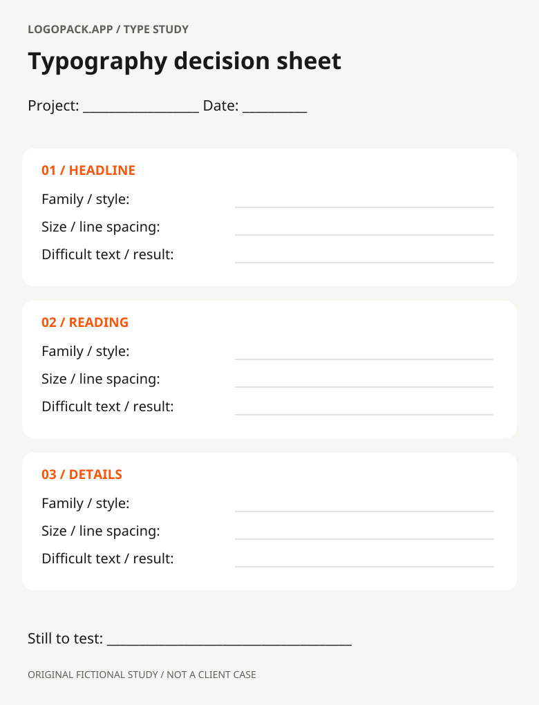
A pair of font names is not a typography specification. Record which family and style belongs to each role, the intended placements, the line-spacing approach and a few examples of longer content. Name the files or versions you tested so a replacement does not silently change the result.
Add a fallback plan for the client’s everyday tools. If a presentation, email or website cannot use the intended family, agree an alternative and inspect that layout too. Check the foundry’s terms for each intended use and who will operate the files; a good visual match does not settle licensing.
The worksheet below keeps the decision compact: role, tested setting, difficult sample and remaining issue. Use it to compare candidates or document the chosen system. It is deliberately a record of decisions, not a scorecard that pretends typography has one numerical winner.
Further reading: Open the printable font-pairing worksheet (SVG)
Three questions worth asking before approval
Does every identity need two fonts?
No. Add another family when it has a useful role or expressive purpose. First check whether one family can do the work through a deliberate hierarchy.
Should both fonts have the same x-height?
Not as a universal rule. Similar proportions can help some relationships, but the full layout, sizes and roles matter. Compare the actual setting rather than selecting from one metric alone.
Can a pairing tool choose the final combination?
It can suggest candidates. It cannot approve your client’s content, language requirements, intended tone, licensing or implementation. Bring the shortlist back into the real design.
Further reading: Noto source and license
PUT IT INTO PRACTICE
Ready to prepare your pack?
logopack.app turns existing SVG artwork into an organized logo package. Preview your files, choose the available export options and check the result before handing it over. Exporting your own logo or icon files requires Pro.
Start with the logo pack generator, explore the sample ZIP, or compare the current plans.
Open generator