Logo design craft
Smooth logo curves: anchors and handles with a purpose
A curve can have very few points and still look wrong. Learn what to move, what to keep and when to stop.
The short answer
Identify the unwanted change in the contour before editing it. Keep deliberate corners, align the handles at joins intended to be smooth, and adjust their reach before adding more anchors. Work on a duplicate and judge the clean silhouette, not just the construction lines.
1. Name the problem before moving a point
Hide the selection and look at the filled mark. Is there an accidental corner, a flat patch in an otherwise round contour, or a small bump left by a rough trace? Those need different edits. A deliberately irregular, hand-drawn mark does not become better simply because every curve is mathematically tidy.
Duplicate the artwork and keep the original beside it. Mark the small region you want to improve and describe the intended result: for example, a continuous upper edge that still ends in a sharp tip. Avoid changing the whole silhouette while trying to repair one join.
Our leaf-like shape is an original fictional exercise, not a client logo or an automatic tracing result. Its uneven and refined versions illustrate a construction decision, not a universal definition of good style.
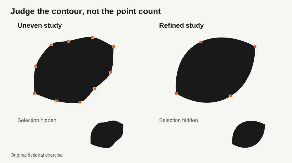
2. Give each anchor a job
Use anchors to describe meaningful changes: the end of a curve, an intentional corner or a useful place to control the next part of the outline. Do not add a point to every tiny wobble. Extra points give you extra things to coordinate, but a complex contour may genuinely need them.
The top, bottom, leftmost and rightmost parts of a round contour can be useful starting positions. Type designers often call these extrema. Glyphs explains why they make outline editing easier; that is a useful construction habit, not a rule that every logo must follow or a reason to force horizontal handles onto a diagonal shape.
Circles and grids can help when the design actually uses that geometry. They are not compulsory scaffolding for an organic mark. Build the contour that serves the idea, then use guides where they make a decision easier to control.
Further reading: Glyphs: drawing good paths
3. Fix a kink at the join
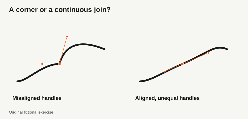
Select the anchor where two curved segments meet. If that join is meant to be smooth, its two handles should point away from the anchor along the same straight line. The path then continues through the join with a consistent tangent direction instead of making an unintended corner.
The handles do not have to be equally long. Their directions control how the curve approaches and leaves the anchor; their lengths influence the surrounding shape. Aligned handles are a starting condition for this smooth join, not proof of even curvature or a pleasing silhouette.
Keep a corner when the design needs one, such as the leaf tip. In Illustrator, Direct Selection exposes the anchors, and the Anchor Point tool lets you change their smooth or corner behavior. Inspect the neighboring segments after converting a point rather than assuming the conversion completed the design.
Further reading: Adobe: draw curves with the Pen tool · Adobe: convert anchor points
4. Change the handle reach before adding another point
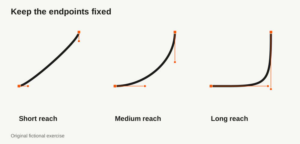
If the join is already smooth but the segment looks too flat, too tight or too swollen, keep the anchors fixed for one comparison. Adjust a handle’s length along its existing direction. Hide the selection and compare the new contour with the original.
The three studies below share the same endpoints and tangent directions. Only the handle reach changes. None is the default correct curve: choose the shape that fits the intended outline and the adjacent segments.
Change one thing at a time. Moving an anchor, rotating both handles and changing their lengths together makes it difficult to tell which edit helped. If the intended contour still cannot be represented cleanly, an additional purposeful anchor may be the right answer.
5. Simplify only while the drawing stays yours
Automatic simplification can reduce the anchor count, but it can also move the contour and soften an intentional corner. Adobe’s Simplify options include Preview and Show Original Path so that you can compare the result with the source. Use those comparisons instead of judging success by the number of removed points.
Work on a copy and review each important turn, tip and internal opening. Undo a reduction that changes the approved character. A smaller file and a cleaner drawing are separate goals; preserving the design matters more than reaching a particular point count.
Further reading: Adobe: Simplify advanced options
6. Finish with the silhouette, not the handles
Compare the original and edited marks without anchors or guides, first at a comfortable working size and then in the actual intended placement. Check the outer contour, negative spaces and deliberate corners. A close-up is useful for finding a kink, but it is not the only view that matters.
Keep the editable construction as the master. Prepare an approved delivery copy separately, reopen the exported SVG and compare it with that master. If the design has live strokes, decide when to outline the delivery copy after the shape is resolved. Packaging assets does not replace this design review.
- Each changed region has a clear reason for the edit.
- Smooth joins have the intended tangent direction; deliberate corners remain corners.
- The silhouette and important gaps still work with the selection hidden.
- The edited mark has been checked in its intended placement.
- The editable master and approved delivery copy are clearly separated.
PUT IT INTO PRACTICE
Ready to prepare your pack?
logopack.app turns existing SVG artwork into an organized logo package. Preview your files, choose the available export options and check the result before handing it over. Exporting your own logo or icon files requires Pro.
Start with the logo pack generator, explore the sample ZIP, or compare the current plans.
Open generator